Favourite Reno Rumble Kitchens

Darren Palmer, interior designer and Judge on Reno Rumble, was floored by the level of detail in each and every one of the twelve Freedom Kitchens revealed on Reno Rumble. “There were so many stand-out kitchens in this series. However, I’ve picked out my top six based on their design, appropriateness to the homeowners, finish and inclusions.”
Here, Darren shares his favourite Reno Rumble kitchen moments…
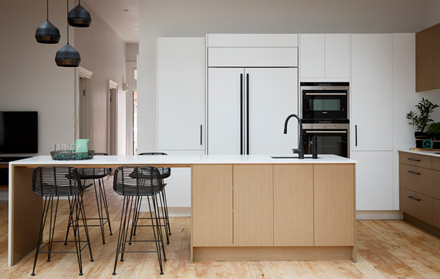
Contemporary Australian by Carly & Leighton
The materials and palette in this kitchen are stunning and it’s great to see a blend of the reliable choice of white being contrasted against timber-grain cabinetry, as well as black, giving the kitchen real wow factor. The beautiful bronze and black pendant lights tie in with the door handles and cabinetry colour, which in turn directed the tapware, chairs and décor choices. The thin profile of the Caesarstone benchtops is absolutely on trend and I love that the day-to-day dining happens at a bench height. This kitchen fits a young couple’s lifestyle perfectly.
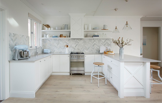
Hamptons by Kyal & Kara
A super-simple palette of white and soft grey works a treat to create a light and bright cook’s kitchen with ample bench space, integrated fridge and dishwasher, and large family-sized pantry. The Shaker-style doors and herringbone marble tiles give this style of kitchen a fresh and contemporary look, whilst still honouring the Hamptons style. Freestanding ovens are de rigueur for the Hamptons style and the concealed rangehood is a modern detail that lifts the traditional style into 2015. This truly is a kitchen that will stand the test of time.
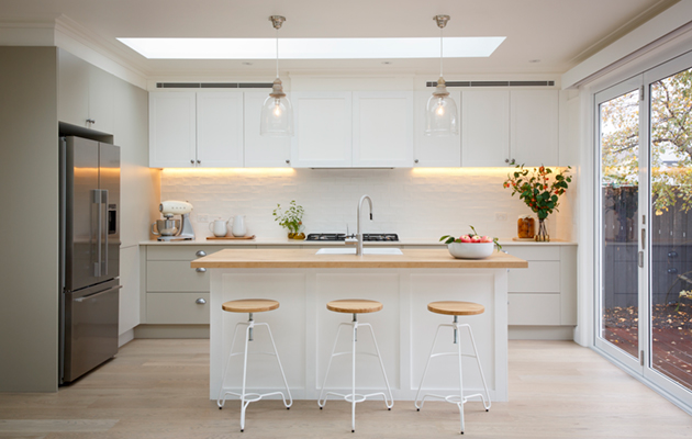
Shaker by Ayden & Jess
Symmetry is the star in this kitchen with the white palette and timber-look laminate bench offering the perfect fresh and homely palette for a young family’s day-to-day needs. The pendants over the generous island solve the challenge of task lighting in a sculpturally beautiful way. The kitchen is a great fusion between both contemporary and shaker style, with detailing being crisp and clean with a nod to the purist, functional brief in a friendly and welcoming way.
Industrial by Carly & Leighton
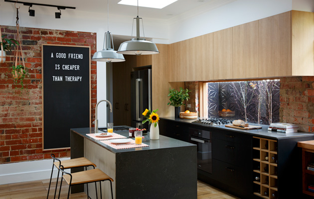
This kitchen bucks the utilitarian approach to industrial design by providing something that is industrial in feel yet visually soft and tactile. The brick wall is a beautiful backdrop and works well with the unique colour palette of timber-grain and black. Integration of appliances always allows for a streamlined look, with the big standout in this kitchen being the knock to open Miele integrated dishwasher. The butler’s pantry containing laundry and fridge works brilliantly and the rules of the working triangle still apply – there is just the right amount of space allowing a perfectly flowing and functional cook’s kitchen.
Modern Vintage by Josh & Jenna
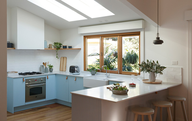
Colour is the star in this modern retro kitchen. The bold choice of blue cabinetry works beautifully with the overall palette, featuring tan leather handles and timber that is carried from the windows through to the open shelves, bookending the concealed rangehood. There’s also pattern and texture cleverly squeezed into this space and the integrated fridge, dishwasher and pantry disappear allowing the porcelain butler’s sink to be the star. This kitchen goes to show you that small can still be mighty.
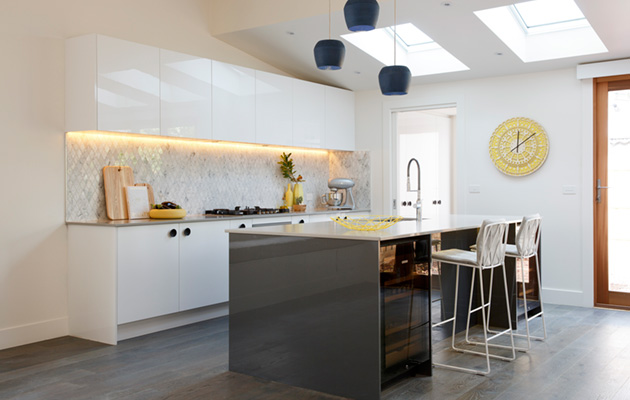
Contemporary Art Deco by Carly & Leighton
This kitchen has all the bells and whistles you’d ever want, a nice wide cooktop, a pair of wine fridges and also shows how you can elevate a simple palette of grey and white with something as simple as a unique and appropriate cabinet knob. The tiles are stunning and the diamond shape of the marble ties in beautifully with the backs of the bar height chairs. More beautiful pendants give the kitchen the punch of colour it needs to lift it from special to out-of-this-world.
