A Modern Take on Mid-Century Kitchen Design
Redbacks House Captains Josh and Jenna presented a beautiful kitchen, one we’d all be happy to call our own. Watch this interview by Interiors Addict with Josh & Jenna and learn how they took a small kitchen footprint and used clever cabinetry and good design to create a functional Mid-Century inspired kitchen.
Read on to hear how homeowners Alice and Stefani reacted to their respective Contemporary Art Deco and Mid-Century Modern kitchens.
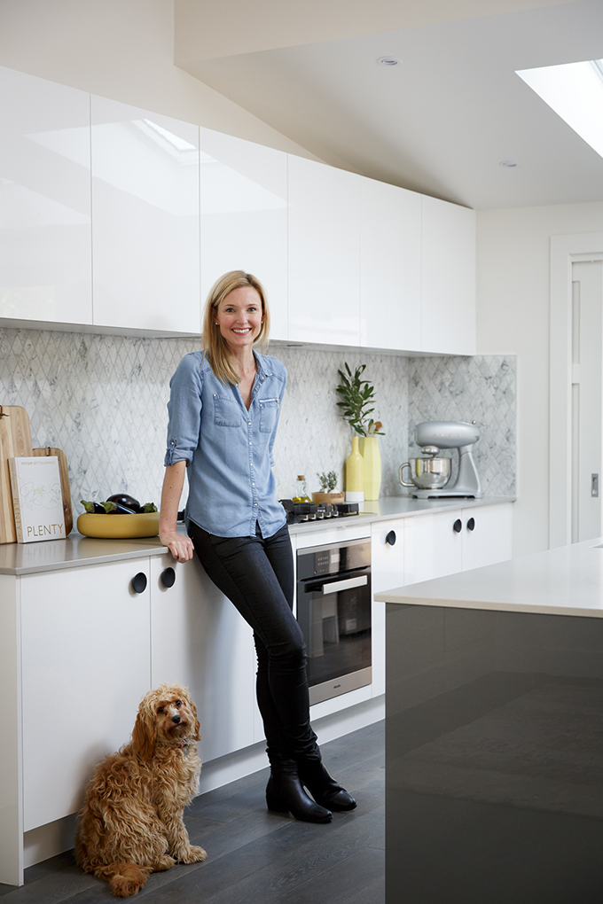
ALICE, CONTEMPORARY ART DECO: Blue Tongues, Carly and Leighton, designed Alice the entertainer kitchen of her dreams. Here’s what she had to say about the reno.
What she was looking for aesthetically…
“We wanted a contemporary space with a touch of art deco that would be timeless,” Alice says, “and complement the original character of the house”.
Thoughts on the colour scheme and style of the space…
“The colour palette of white and grey/marble used in the kitchen flows throughout the rest of the house and the the geometric pattern in the splashback carries through the strong art deco lines/patterns in the rest of the house”.
What Alice loves most in the space…
“There are too many things to list, it’s too hard to pick. We love that we now have plenty of storage space and benchtop space, the pull out pantry doors and the large cook top!”.

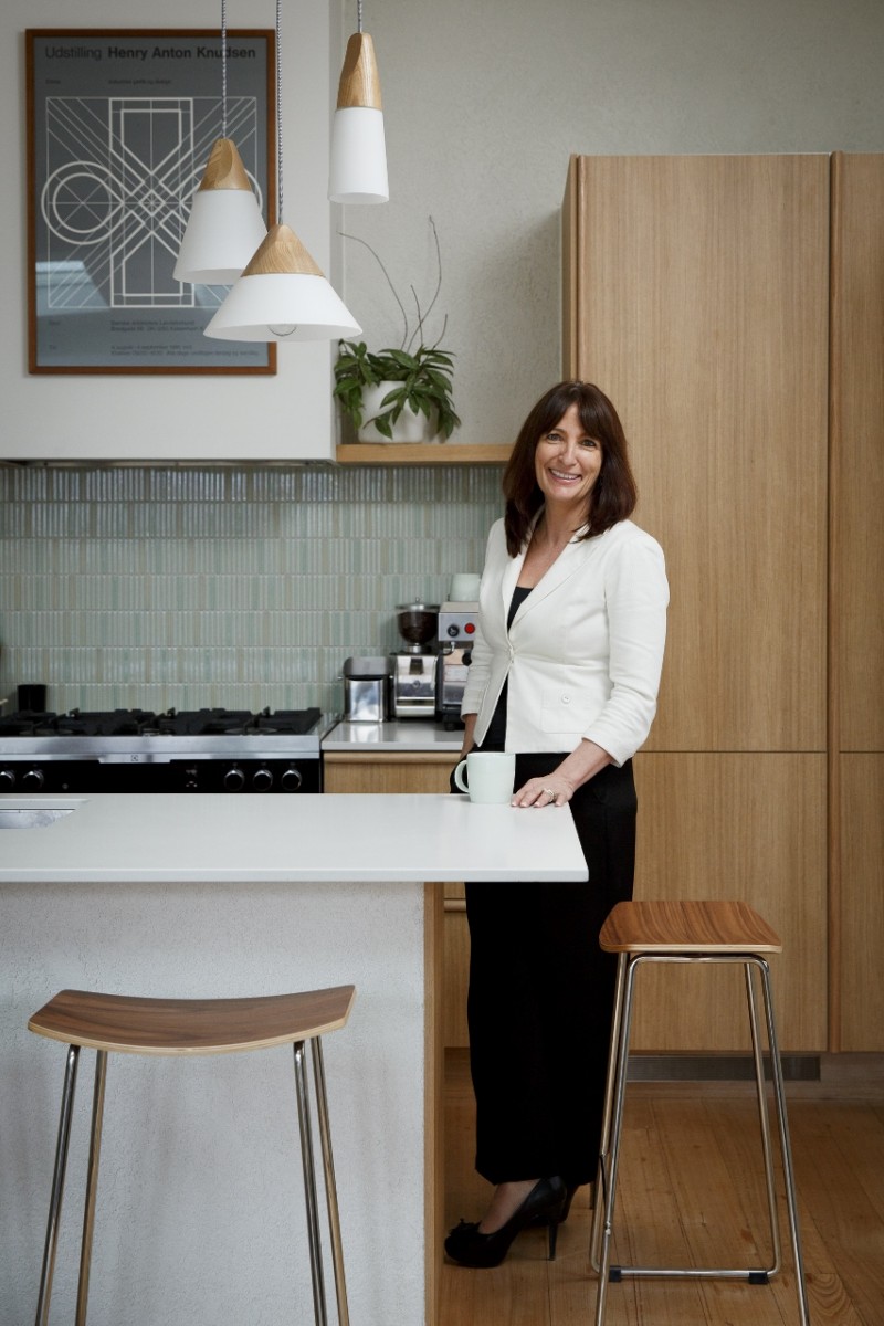
STEFANI, MID-CENTURY MODERN: Josh and Jenna came to the rescue of home owner Stefani, whose busy family kitchen was looking worse for wear. Stefani certainly thinks the Redbacks have delivered a kitchen that ticks all the boxes.
Stefani on the colour scheme and styling choices…
“Our new Freedom Kitchen blends in effortlessly and looks very high-end and stylish and is so user friendly,” Stefani says. “The colours and textures of the materials used are bang on the mid-century modern brief but completely work in a 2015 modern home environment”.
What the family loves the most about the new space…
“We love having our fridges ‘built in’ so they are hidden behind the matching timber grain cabinet doors. Makes the kitchen look more natural and textured, less about the white goods. We have two [pull out pantries] and they are life changing! We can see everything in the pantry and easily stack, store and access whatever it is we want to use”.
How the new kitchen has changed their lives…
“We now appreciate what can be achieved with clever cabinetry and good design in a smaller footprint. The new kitchen takes up less space and provides greater functionality without sacrificing style”.


