

How to Choose Kitchen Colours That
Suit Coastal-Inspired Homes

Key Takeaways
- A well-planned kitchen colour scheme in 2026 should still feel fresh and appealing in 10+ years, supporting both everyday living and resale value.
- Whites, soft neutrals, and natural timber looks are the backbone of a timeless Australian kitchen, with bolder colours best used on cabinetry, islands, and accessories.
- Light direction, artificial lighting, and your home’s existing finishes (floors, window frames) are just as important as paint samples when choosing a palette.
- Freedom Kitchens is an Australian-made cabinetry specialist that can help plan, visualise, and supply a cohesive colour scheme via showrooms and a free design appointment.
- This guide covers practical, example-based ideas: warm and cool palettes, bold and neutral combos, small-kitchen tricks, and how to future-proof your selections.

Why Your Kitchen Colour Scheme Matters in 2026
The kitchen is usually the most-used room in an Australian home, and colour is what visitors notice first when they walk in. Whether you’re planning a full kitchen renovation or designing a new build, your colour palette sets the tone for how the space feels and ages over time.
A kitchen is often a five-figure investment. Data from Australian real estate analyses indicates kitchens with neutral palettes command 5-10% higher sale prices in urban markets, reflecting buyer preference for versatile schemes over trend-driven specificity.
This guide is tailored to Australian homes, using warm whites, greige, eucalyptus green, navy, charcoal, and warm timber tones.
Planning Your Kitchen Colour Scheme: Start with How You Live
The perfect kitchen colour scheme depends on how your kitchen is actually used. Before selecting any colours, work through this planning checklist:
- How much natural light does the room receive? Photograph the space in the morning, midday, and evening to understand how light shifts.
- Is the kitchen open to living and dining areas? Open-plan layouts need cohesive colour flow between rooms.
- How long do you plan to stay? Short-term owners can layer bold accents on swappable items, while long-term residents should prioritise versatile bases.
Decide early what should be long-term neutrals (cabinetry, benchtops, flooring) versus what can be swapped later (bar stools, pendant lights, splashback paint, décor).
Our in-home, in-store, and virtual design consultations let you talk through lifestyle and colour goals with a designer before selecting cabinetry, ensuring your choices work for your actual life.

Understanding Colour, Mood, and Light in the Kitchen
Colour isn’t only aesthetic; it changes how big, bright, warm, or calm your kitchen space feels. Interior design research shows that soft greens and dusty sages evoke a calming effect by mimicking eucalyptus foliage. At the same time, terracotta and blush tones introduce warmth and create an inviting kitchen atmosphere.
Consider your home’s orientation when selecting colours. In north-facing spaces with harsher light, cooler tones such as cool whites and soft greys tend to work best. In south-facing spaces where the light is more diffused, warmer undertones like greige and creamy whites can create a more balanced, inviting feel.
Glossy finishes reflect up to 80% more light than matte surfaces, making deeper hues like navy or forest green feel less heavy in medium-sized rooms.
Artificial light plays a huge role too. LEDs at 2700K warm tones enhance earthy tones, while 4000K cool lights amplify blues. Pendant lights over islands, LED under-cabinet strips, and skylights all help “correct” or enhance how chosen colours appear at night.

White and Monochrome Foundations for Coastal Homes
White remains the most popular starting point for Australian kitchens because it blends seamlessly with open‑plan living and adapts easily as styles evolve. In 2026, we have seen a focus on warmer whites as they add depth and pair perfectly with other tones such as timber looks.
In coastal-inspired homes, white does even more: it amplifies natural light, enhances the breezy, relaxed feel, and creates a calm backdrop for timber, stone, and ocean‑inspired accents.
Understanding undertones is essential:
-
Warm whites with cream or beige notes pair beautifully with oak, rattan, and warm coastal timbers.
-
Cool whites with blue or grey undertones complement concrete-look or marble-look benchtops and coastal blues.
-
Neutral whites bridge both worlds, ideal for open-plan homes where light shifts throughout the day.
White can feel clinical without texture, so coastal homes rely on natural materials to soften the look. “White creates a blank canvas,” explains Felicity Page from Freedom Kitchens & Wardrobes. “But it can feel clinical without natural texture, so I recommend that this is something that is considered when planning your colour palette.”
Timber-look shelving, textured splashback tiles, woven pendants, and warm metallic handles add depth and warmth. Freedom’s cabinetry ranges offer finishes that introduce this natural softness without relying solely on colour.
Monochrome also suits coastal interiors, especially when balanced with organic textures. Homeowners wanting more personality can introduce a contrast island or coloured lower cabinets while keeping the perimeter light and airy.
Combining Colours in a Coastal Home: Simple Rules that Actually Work
Coastal-inspired homes feel calm because the palette is controlled. Your document highlights the importance of restraint: “Most successful kitchens stick to 2–3 main colours plus metal finishes,” explains Felicity.
The 60:30:10 rule works beautifully in coastal spaces:
- 60% dominant neutral: Soft white cabinetry and walls
- 30% supporting colour: Light oak flooring, pale timber island panels
- 10% accent: Black hardware, deep green or navy stools, coastal blues
This keeps the palette harmonious and prevents visual clutter.
Practical steps still apply:
- Choose cabinetry and benchtops first – the anchors of the space.
- Build your wall, splashback, and décor colours around those choices.
- Keep metal finishes consistent across taps, handles, and lighting to maintain flow. Brushed nickel and soft brass finishes are popular choices for coastal kitchens, offering a timeless look that complements light, natural palettes while adding a subtle layer of warmth and texture.

Warm Kitchen Colour Schemes: Cosy, Earthy, and Timeless
Warm palettes are ideal for creating a welcoming feel in family kitchens. The growing desire for cosiness has seen earthy tones rise 40% in adoption since 2024.
Example warm palettes:
|
Cabinetry |
Accents |
Benchtop |
Hardware |
|
Greige (grey-beige) |
Walnut panels |
Creamy quartz |
Brushed brass |
|
Warm white |
Tasmanian oak |
Honey-toned stone |
Bronze handles |
|
Off-white |
Terracotta splashback |
Warm oak floors |
Matte gold |
These schemes feel modern when paired with streamlined flat-panel Freedom cabinetry and minimal profiles, avoiding ornate details that date quickly. Warm schemes combine especially well with statement woven pendants over an island, adding natural texture that reinforces the cosy atmosphere.
Warm Coastal Palettes: Cosy, Earthy, Timeless
Warm coastal schemes draw from sand, driftwood, and sunlit stone. These palettes feel grounded and welcoming- ideal for family homes along the Australian coastline.
Examples:
- Greige cabinetry + walnut accents + creamy quartz + brushed brass
- Warm white joinery + Tasmanian oak + honey-toned stone + bronze handles
- Off-white cabinetry + terracotta splashback + warm oak floors + matte gold
These combinations feel modern when paired with streamlined Freedom flat‑panel cabinetry. Woven pendants, jute runners, and natural textures reinforce the relaxed coastal mood.

Cool Coastal Palettes: Fresh, Calm, Airy
Cool palettes such as soft blues, muted greens, and cool greys are the heart of coastal homes. These hues mimic ocean water, sea mist, and eucalyptus foliage. These favourite hues create an airy feel that suits Australian beach culture.
Examples cool palettes:
- Dusty blue cabinets: Lower cabinets in soft blue, white uppers, black handles
- Eucalyptus green: Green cabinetry with pale stone benches and matte white splashback tiles
Cool tones can feel clinical without warmth so balance cooler tones by adding:
- Natural timber stools (oak adds warmth perceptually)
- Jute runners or woven rugs
- Warm LED lighting (2700K-3000K)
Deep forest green or navy on a kitchen island can create contrast against white or pale timber tall cabinets for a confident, timeless style. Cool palettes pair especially well with stainless-steel appliances and brushed nickel tapware.
Bold Meets Neutral: Statement Colours That Still Feel Timeless in Coastal Homes
In coastal homes, bold tones work best when inspired by nature, such as deep ocean blues, seaweed greens, or sun-baked terracotta.
Example bold combinations:
|
Feature Element |
Perimeter |
Flooring |
Balance Element |
|
Navy island |
White cabinetry |
Light oak |
Brass hardware |
|
Oxblood lower cabinets |
Creamy upper cabinets |
Stone-look tiles |
Pale benchtop |
|
Emerald pantry doors |
Light neutrals |
Timber flooring |
White splashback |
Moody jewel tones feel timeless when balanced with natural materials like walnut and stone. Bold colours should sit on elements that can be repainted, while benchtops and floors remain neutral for longevity.
Playing It Safe, Then Playing It Bold with Accessories
For those hesitant about permanent colour commitments, accessories carry brighter colours without altering built-in joinery.
Coastal-friendly additions include:
- Sky-blue or seafoam pendant lights
- Rattan or timber stools
- Patterned splashback tiles in small doses
- Blue or terracotta small appliances
- Artwork, ceramics, and plants
This approach suits homeowners planning to sell within 3–5 years or those who prefer a neutral base with seasonal updates. Accessories are quick to swap if tastes change, while cabinetry and benchtops are long-term commitments.
Colour and Space: Schemes for Small, Large, and Open-Plan Kitchens
The same colour can feel completely different in a small, enclosed kitchen versus a large open-plan living-dining space.
For small apartments:
- Choose light neutrals for cabinetry
- Use integrated handles to minimise visual lines
- Keep contrast minimal to expand space visually
- Add colour only on the splashback
For galley kitchens:
- Consider darker base cabinets with lighter uppers for a height illusion
- Use pale benchtops that reflect light from end to end
- Glass cabinet doors prevent a heavy feel
For large open-plan family homes:
- Repeat timber tones from TV joinery in the kitchen
- Use the same wall colour throughout adjoining rooms
- Maintain consistent metal finishes across spaces
Freedom’s cabinetry extends into pantries, laundries, and home offices for a whole-of-home colour story that feels intentional rather than piecemeal.
Bring Your Colour Scheme to Life with Freedom Kitchens.
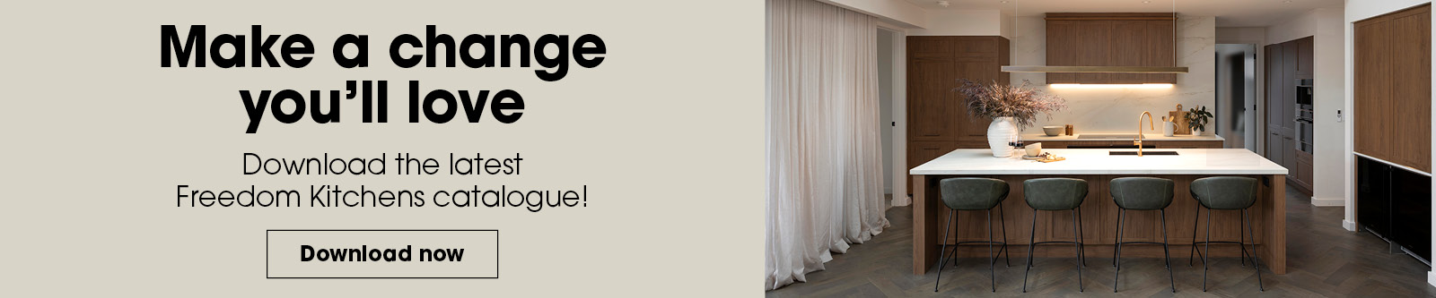
Book your free design appointment today and turn your vision into a reality, or download our Designer Range Catalogue for more inspiration.
FAQ’s
Can I use dark colours in a small kitchen without making it feel cramped?
Dark colours can work in a small kitchen if used carefully. Apply them on lower cabinets or the island only, paired with light benchtops and splashbacks. Keep upper cabinets light or use open shelving to avoid heaviness near eye level. Good lighting is essential—under-cabinet LEDs, reflective splashback tiles, and glass doors offset darker base units. Use Freedom’s 3D planning tools to preview how darker kitchen colour schemes appear in compact floorplans before committing.
How do I coordinate my kitchen colour scheme with my flooring and adjoining rooms?
Flooring is usually the most dominant existing element, so its undertone (warm, cool, red-based, yellow-based) should guide cabinet and benchtop choices. Repeat at least one element from adjoining spaces—the same wall colour, timber tone, or metal finish—to visually link rooms. Consider the view from living and dining areas: the kitchen should read as one calm, cohesive block rather than a patchwork of unrelated tones. Freedom designers help match cabinetry finishes to existing timber floors, tiles, and window frames.
What if I change my mind about colours in a few years?
Choosing neutral, Australian-made Freedom cabinetry and benchtops gives you a solid base that won’t need frequent replacement. Repainting walls and changing hardware, pendant lights, and bar stools is far easier and more affordable than replacing joinery or stone. Opt for classic door profiles and versatile colours now, using accessories to reflect future kitchen design trends or personal taste shifts. Book a Freedom design consultation to build a flexible colour scheme that adapts over the next decade without major renovation.